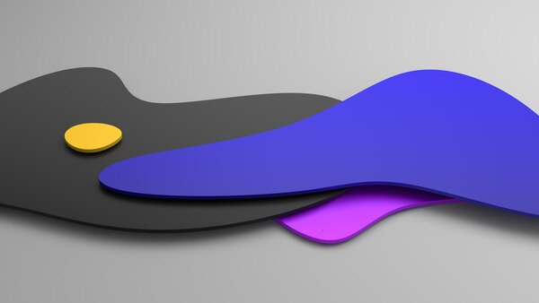
Minimalist Branding: How Less Design Creates Stronger Identities
Minimalist branding isn’t about stripping things away until they’re boring; it’s about refining until only the essential remains. When done well, minimalism doesn’t make a brand quiet—it makes it unmistakably clear.
Below is how and why “less design” often leads to stronger, more enduring brand identities.
Why Minimalism Works in Branding
1. Instant recognition through simplicity
The human brain prefers simple patterns. Clean, uncomplicated shapes and limited color palettes are easier to process and remember. That’s why logos like Nike’s swoosh or Apple’s bitten apple work so well: they’re immediately recognizable at any size, in any context.
Minimalist brands leverage this by:
- Using a small number of core visual elements
- Avoiding intricate details that get lost on small screens or social media
- Designing marks that hold up in black and white as well as in color
When there’s less to decode visually, recall becomes faster and stronger.
2. Clarity in a noisy environment
Most markets are saturated with visuals: ads, feeds, notifications, endless content. Maximalist design can add to that noise. Minimalism, by contrast, creates a pause.
A clean layout with generous whitespace, a single focal point, and limited colors stands out precisely because it’s calmer than everything around it. This “visual breathing room”:
- Draws attention to the message instead of the decoration
- Signals confidence—only brands sure of themselves can resist over-explaining
- Helps audiences quickly grasp what you offer and why it matters
3. Focus on meaning, not decoration
Minimalist branding forces hard decisions: if you can include only a few elements, each one has to carry meaning.
This leads to:
- Symbols distilled to their core idea rather than literal illustrations
- Typefaces chosen to reflect personality (confident, friendly, luxurious) instead of trendiness
- Color used as a strategic signal (trust, innovation, calm) rather than a rainbow for its own sake
“Less” becomes a tool to focus attention on “why we exist” instead of “look at everything we can design.”
4. Flexibility across platforms
Brands now live everywhere—on apps, websites, packaging, billboards, tiny smartwatch screens, and social avatars. Overly detailed branding breaks when scaled down or translated across media.
Minimalist systems are naturally:
- Responsive: simple shapes and clear typography adapt well to different sizes
- Versatile: a stripped-down logo can be animated, cropped, or layered without collapsing
- Future-ready: clean, timeless elements age more gracefully than highly stylized trends
This flexibility is crucial for consistent recognition in a fragmented digital landscape.
Core Principles of Minimalist Brand Design
1. Reduction, not emptiness
Minimalism isn’t about having as little as possible; it’s about having nothing unnecessary.
Ask of every element:
- Does this help express our core idea?
- Would the meaning suffer if we removed it?
If the answer is no, remove it. What remains is intentional, not accidental.
2. Strong concepts underneath simple visuals
A simple design with a weak idea feels generic. A simple design with a strong concept feels iconic.
Behind minimalist brands, you typically find:
- A clear positioning (who we serve, how we’re different)
- A distilled narrative (the one sentence that defines the brand)
- Visual metaphors or structures connected to that narrative
The visible simplicity is a surface expression of a deeply clarified identity.
3. Limited but consistent visual language
Minimalist brands tend to define a small, strict set of building blocks:
- Logo: one primary mark, sometimes a monogram or symbol variant
- Color: one to three core colors, used consistently
- Type: one or two type families for all communications
- Layout rules: clear guidelines for spacing, hierarchy, and alignment
Because there are fewer pieces, each repetition reinforces recognition. Consistency is the force multiplier.
4. Whitespace as a design tool
Whitespace is not “empty” space; it’s active structure.
It:
- Guides the eye to what matters most
- Creates a sense of calm and confidence
- Helps separate elements so content becomes easier to read and understand
Minimalist branding uses whitespace deliberately to shape rhythm, emphasis, and perceived quality.
Psychological Impact of Minimalist Branding
1. Perception of quality and trust
Clean, restrained design is often associated with professionalism and premium quality. When a brand doesn’t overload visuals, it suggests:
- Confidence in its product or service
- Respect for the customer’s time and attention
- Operational competence and discipline
This is particularly powerful in sectors where trust is critical: finance, healthcare, technology, and luxury.
2. Emotional space for the audience
Minimalist branding leaves room for the viewer’s interpretation and imagination. Rather than dictating every emotion with complex imagery, it offers a framework that audiences can project onto.
This can:
- Make brands feel more universal and adaptable
- Help different audiences see themselves reflected in the brand
- Allow messages to breathe, making them feel considered rather than pushy
3. Reduced cognitive load
Every additional element on a page or in a visual demands mental processing. High cognitive load can create fatigue and reduce engagement.
Minimalist design reduces:
- Decision fatigue in interfaces (clearer calls-to-action, less clutter)
- Visual stress, especially on small screens
- Friction when scanning for key information
The result is smoother user experiences and a higher chance that key messages are actually absorbed.
How to Build a Minimalist Brand Identity
Step 1: Clarify the brand’s core
Before touching visuals, answer clearly:
- What problem do we solve?
- For whom?
- What do we want to be known for in one sentence?
Minimalist branding fails when this foundation is fuzzy; visual restraint will only highlight confusion.
Step 2: Define the essential elements
From that core, derive:
- A short brand promise or tagline
- Three to five brand attributes (e.g., bold, calm, precise, playful, visionary)
- A tone of voice that matches those attributes
These choices will guide the visual direction.
Step 3: Design a logo that scales
Focus on:
- A distinctive, simple shape that remains recognizable at tiny sizes
- Removing unnecessary lines, shadows, and decoration
- Creating one strong primary version and, if needed, a simplified icon version
Test it in:
- Favicon size
- Mobile navigation bar
- Social media avatar
If it’s legible and recognizable there, you’re on the right track.
Step 4: Limit and systematize color
- Choose one main brand color, plus one or two supporting tones at most
- Ensure strong contrast for accessibility
- Define exact color values (HEX, RGB, CMYK, Pantone)
Use color systematically:
- One color for primary actions or key highlights
- Neutrals for background and text
- Reserve accent colors for very specific functions
Step 5: Choose typography as a voice, not decoration
Select:
- One primary typeface for headings and key statements
- One complementary typeface (or weights/styles of the same family) for body text
Prioritize:
- Legibility on screens
- A character that matches your attributes (e.g., geometric sans for modern precision, serif for heritage and depth)
- Clear hierarchy via size, weight, and spacing instead of complex styling
Step 6: Establish layout and spacing rules
Define:
- A grid system (columns, margins, gutters)
- Standard spacing increments (e.g., 4px scale in digital)
- Rules for hierarchy (headline > subhead > body > caption)
Use whitespace to:
- Separate sections clearly
- Highlight one primary message per screen or page
- Create a sense of rhythm and order
Step 7: Document and enforce a minimal brand system
Create clear guidelines that cover:
- Logo usage and misuse (what never to do)
- Color usage with examples
- Typography pairings and examples
- Layout examples for key touchpoints (website hero, social post, email header, presentation)
Minimalism needs discipline. The system prevents gradual clutter from creeping in over time.
Where Minimalist Branding Shines—and Where It Doesn’t
Works especially well when:
- The product or service is already strong and doesn’t need heavy “selling”
- The target audience values clarity, efficiency, and sophistication
- The brand needs to function seamlessly across many digital contexts
- Longevity and timelessness matter more than following visual trends
May struggle when:
- The brand’s value is tied to exuberance, chaos, or excess (e.g., certain entertainment or youth subcultures)
- There’s a lack of strategic clarity; minimal visuals will expose that gap
- Stakeholders equate “simple” with “easy” and underinvest in brand thinking
Minimalism is a tool, not a universal rule. The right question is: does “less” express who we are more truthfully and powerfully?
Measuring Strength in a Minimalist Brand
Stronger identities are not just prettier; they perform better. For minimalist branding, watch for:
- Recognition: Can people recall or sketch the logo from memory after brief exposure?
- Consistency: Do all brand touchpoints feel unmistakably like the same company?
- Clarity of perception: When people describe the brand in a few words, do those words match your intended attributes?
- Ease of use: Are design teams and partners able to create on-brand materials quickly using a small set of rules?
- Longevity: Does the brand still feel relevant and “like itself” as trends shift?
If the answer is yes across these dimensions, your minimalist approach is likely strengthening—not weakening—your identity.
The Real Power of “Less”
Minimalist branding is not an aesthetic fad; it’s a discipline of making deliberate choices. By removing visual noise, you force your brand to stand on its core: its promise, its personality, its point of view.
Less design, in this sense, doesn’t mean less identity. It means less distraction from the identity that matters.
When minimalism is driven by clarity rather than fashion, it creates brands that are:
- Recognizable at a glance
- Adaptable across mediums and time
- Trusted for their focus and confidence
That is how “less” design often leads to stronger, more enduring brand identities.